

 Kristin Jordan
Why Businesses Use Magento 2
With Magento 2 as your eCommerce platform, you can create a unique and engaging customer experience to make an excellent first impression and keep your customers returning

Customers can determine almost immediately whether they like your eCommerce website or not. If they’re confused or overwhelmed by your design, they will most likely move on to more user-friendly sites. It is extremely important that your site is easy to navigate and visually appealing so your customers have a positive experience and your business can flourish.
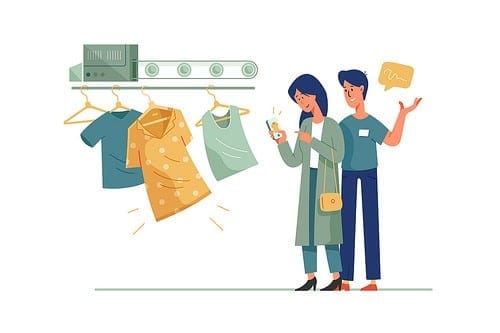
Make it easy for your customers to find the products they love, and provide them with a seamless and enjoyable shopping experience. Here are five Do’s and Don’ts to incorporate in your design plans to move shoppers through your the sales funnel.
Unfortunately, most brands fail to create effective product filters their customers can actually use. Baymard Institute’s usability testing of 19 sites and their benchmarking of 50 major eCommerce sites on Product Lists & Filtering usability showed that 84% provided mediocre or poor product-filtering experiences. Few sites performed better than Macy’s, which helps customers sort through thousands of items to find the top options they seek.
So, how can websites improve their search capabilities? Many eCommerce brands try to let customers filter their results, but few do it well. To make filtering easier and more effective, consider adding these elements:
Developing filters for your website isn’t as easy as installing an application programming interface (API) that looks good. Make sure your development team completely understands and addresses the search needs of your customers.
If your search bar is hidden at the top right corner of your site, you’re probably isolating a large percentage of your customers. On average, 30% of customers will try to type something into the internal search box. If your search box is difficult to find or the search widget is out of date, you’ve created a negative experience for one-third of your site visitors, hence decreasing potential sales.
Not only are you annoying customers who have a difficult time locating or using your search box, you’re decreasing your potential sales. The eCommerce growth consultants at AcquireConvert report significantly higher revenue from customers who use search boxes, and conversion rates an average of 5-6 times higher. Place your search function where your customers can easily spot it, and keep it consistent throughout your site.
When a shopper visits your website for the first time, what categories do they see? If you check your top navigation bar and don’t see the main categories that people buy from, then you may need to redesign your page.
The Baymard Institute recently called out Best Buy for its confusing navigational hierarchy. Customers have to click on the “Products” tab before they can see a drop down of the products available. While this may only create a few seconds of delay for regular Best Buy shoppers, it can confuse new customers who aren’t familiar with the brand. It would be more convenient for customers to be able to click right to the appliance, camera, or computer section without clicking the unnecessary products tab.
Best Buy isn’t the only company with this problem; 18% of eCommerce sites simply list “Products” at the top and expect customers to click through subsequent menus.
How you choose to display your top navigation may depend on your industry, but most web designers place the highest-selling categories in the far left part of the bar, and then work through their less popular categories heading to the right along the bar.
Even a simple eCommerce website can become a black hole for customers trying to find their favorite products. Between complex categories and set filters, it can be difficult for people to remember what they are looking at and how they got there. The best eCommerce sites keep customers on track throughout their entire shopping and purchasing journeys.
REI Co-op does a great job leading customers to the products they seek. Categories are clear on every page, and category hierarchies are easily spotted directly above them. Multiple filters in the left column are well-organized and easy to use.
If your eCommerce brand has brick-and-mortar retail counterparts, make sure you consider what your in-store shoppers want, along with your online buyers. Almost 60% of brick-and-mortar shoppers use their smartphones to look up product information and prices. Additionally, 40% of shoppers look up coupons before they buy.
You can see which brands understand this by their mobile eCommerce website design. For instance, JC Penney prioritizes coupons on its mobile page, for both online and in-store redemption. Kohl’s actually creates in-store signage encouraging customers to find their appropriate sizes and favorite colors online.
As you increasingly focus on your customers’ mobile experience, make sure you’re designing your pages with both online and in-store shoppers in mind.
Use these eCommerce website design examples to optimize your customers’experience and keep them returning.
Check back to soon for Part Two: Optimizing Your eCommerce Product Pages to Improve the Customer Experience.

With Magento 2 as your eCommerce platform, you can create a unique and engaging customer experience to make an excellent first impression and keep your customers returning
Let's look at ways to make your B2B checkout easier and get more customers to buy. We'll see how these ideas can help you make more money and make customers happier.

Staying connected with your customers is always the key to long-term retention and healthy relationships.